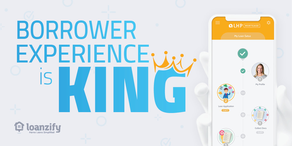
User experience, or UX, is one of the most important factors in digital lending. It is indeed the X-factor that differentiates your mortgage business from your competitors and what fosters loyalty amongst customers. It’s also the tipping point for conversion — meaning it’s what determines a completed loan application versus an abandoned one.
Many mortgage pros are surprised to hear this. With so much focus on tech function and integrations (all critical to operation) and increasing leads, many overlook the critical X-factor that actually accomplishes the goal of increasing revenue — having more “completed” applications!
User experience should matter to you because it’s the primary thing that matters to your borrowers when applying for a home loan.
Here’s a quick rundown of what UX looks like and why it’s the differentiating X-factor in mortgage POS systems.
What is UX?
UX is how your borrower feels when interacting with your online mortgage (e.g. your mortgage POS). This includes mobile and desktop applications, instant messaging, document uploading, and any form of borrower/POS system interaction.
Why UX is essential to the Online Mortgage Journey?
The goal of UX is to fulfill the user’s needs by creating a positive experience that keeps the application moving forward towards completion. It also makes the loan experience enjoyable and more meaningful to enhance loyalty to your brand.
What makes a great UX for mortgage applications?
The most important element for UX in the mortgage application is the design, which includes content and the workflow, too. From end to end, a great UX feels intuitive and effortless for the borrower.
There are several elements that go into creating a phenomenal mortgage UX. Here are some of the ones that we focused on when designing Loanzify POS:

Adaptable. We incorporated responsive design so that it functions properly regardless of the device your borrower uses.
Branded. Trust is essential to building relationships and your business. Loanzify’s white-label platform allows you to make it your own. Upload your logo, change the colors, and even edit the content to match the look and feel of your brand.
Configurable. Every element on the Loanzify mortgage has a defined objective and serves to make make the application process effortless and enjoyable. On the backend, these functions are configurable to your operations and help to automate tasks and reduce the cost per application –among other benefits.
Functional. Attention-grabbing design that doesn’t distract from the function is essential for keeping your prospect engaged and loan moving forward. Even the tone and wording of the questions are carefully designed to simplify the application process!
Navigation. Loanzify’s UX design facilitates system navigation so borrowers can easily find what they are looking for.
Connected. Loanzify is more than a place to apply for a mortgage — it’s the hub of managing their loan and connecting with those that help to make it happen. In-app mortgage calculators, mortgage content, instant messaging, and real-time loan timeline make Loanzify an indispensable tool for every real estate investor and borrower.
Experience the difference yourself! Sign-up for a live demo of Loanzify POS to see what a phenomenal borrower experience that converts looks like!


Pingback: Loanzify POS: The Intuitive Workflow Game-Changer | LenderHomePage
Pingback: "Engage And Manage Your Mortgage Team -Loanzify POS Brings It All Together | LenderHomePage
How can I save my own MI factors on conventional loans? My app won’t save my figures and reverts to FHA MI on all conventional calculations.
Hi Neil! A support ticket has been submitted on your behalf. Thank you!
Pingback: 5 Technologies Mortgage Brokers Are Using to Win Digital Consumers – OMNH.com